Tracking Server Health
Health Monitor displays the information on server resources usage in two ways:
- A summary report on all main health parameters.
- A detailed report with graph of changes for each health parameter.
Summary Report
The summary report contains the information on all main server health parameters that are grouped for the sake of convenience. The report displays the status of each group, the instantaneous parameter values and their trends. To get the Health Monitor summary report, go to the Server Administration Panel > Home > Server Health.
Note that the summary report shows you instantaneous parameters values that are relevant only for the moment when the Home page was refreshed.
Note: If the server has multiple CPU cores, the available CPU usage is equal to 100% * the number of CPU cores. For example, if your server has 4 CPU cores, the available CPU usage is 400%.
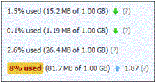
The example of summary report (random values) is shown below.

Yellow and Red Alarms
As you can see, one of the parameters exceeded some threshold and Health Monitor alarmed about it with the yellow highlighting. There are two types of alarms for each parameter:
- Yellow alarm - a parameter is close to its critical value.
- Red alarm - a parameter exceeds its critical value.
The threshold of these alarms can be set using the configuration file.
Trends
Health Monitor can also warn you if one of the parameters grows too
fast. This is done with the help of trends. Trend is a way to show how a
parameter value changes over time. In this example, the parameter, which
was the source of the alarm increased (
Detailed Report
Detailed report can help you find out the time periods when the resources usage is maximal (minimal). To view the report, go to the Server Management > Health Monitoring. To see how server health parameters have been changing over time, select the corresponding checkboxes. You can select a period for which the graph is generated: From the past 3 hours to a week.
Note that the parameters values behind the graph are also instantaneous and are relevant only for the moment when the page was refreshed.